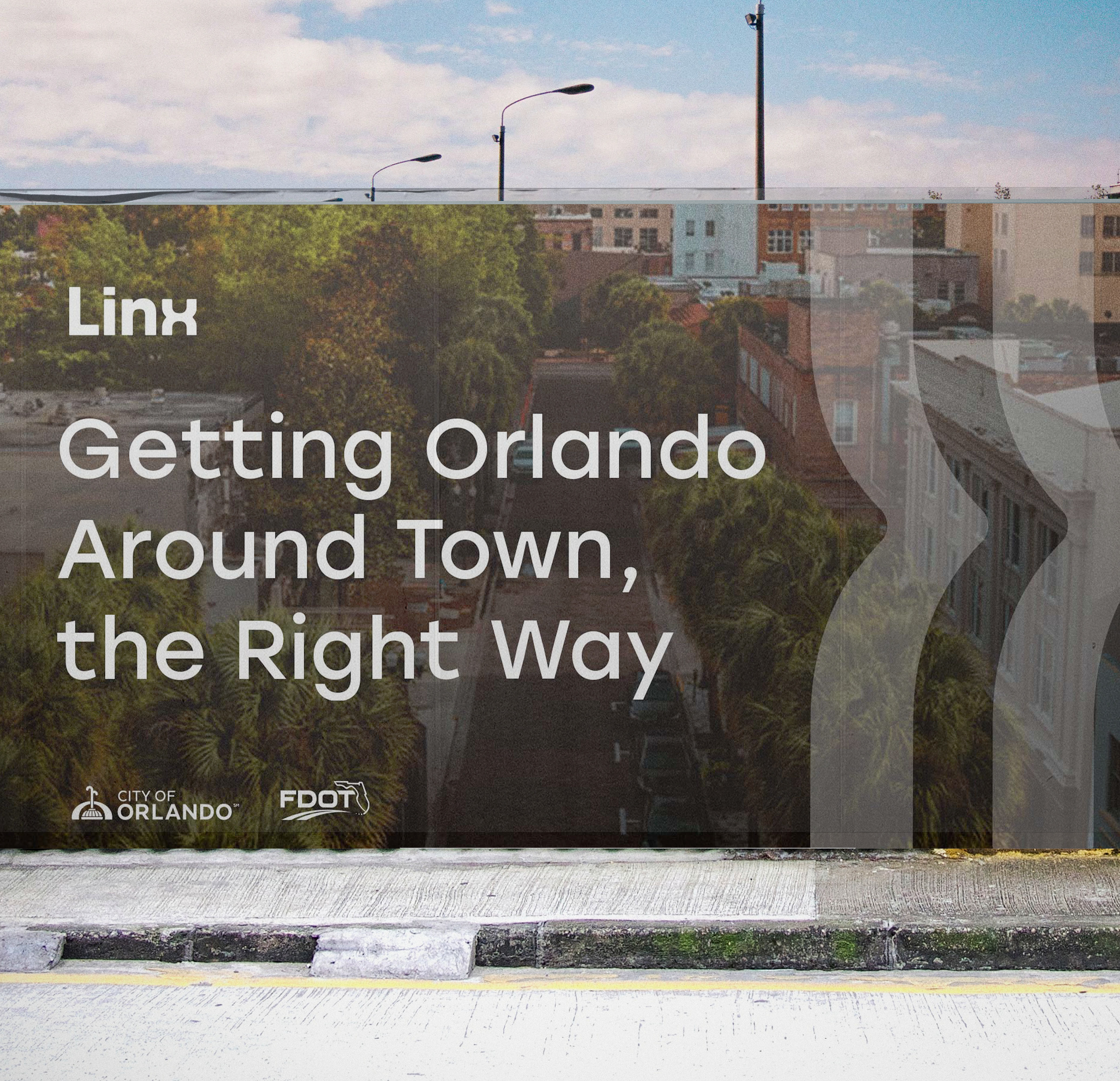
Lynx Bus Rebrand
Many people in Orlando rely on public transportation to get to their jobs, grocery stores, and recreational destinations, especially in a city that is so spread out. However, the Lynx bus system is outdated and clunky.
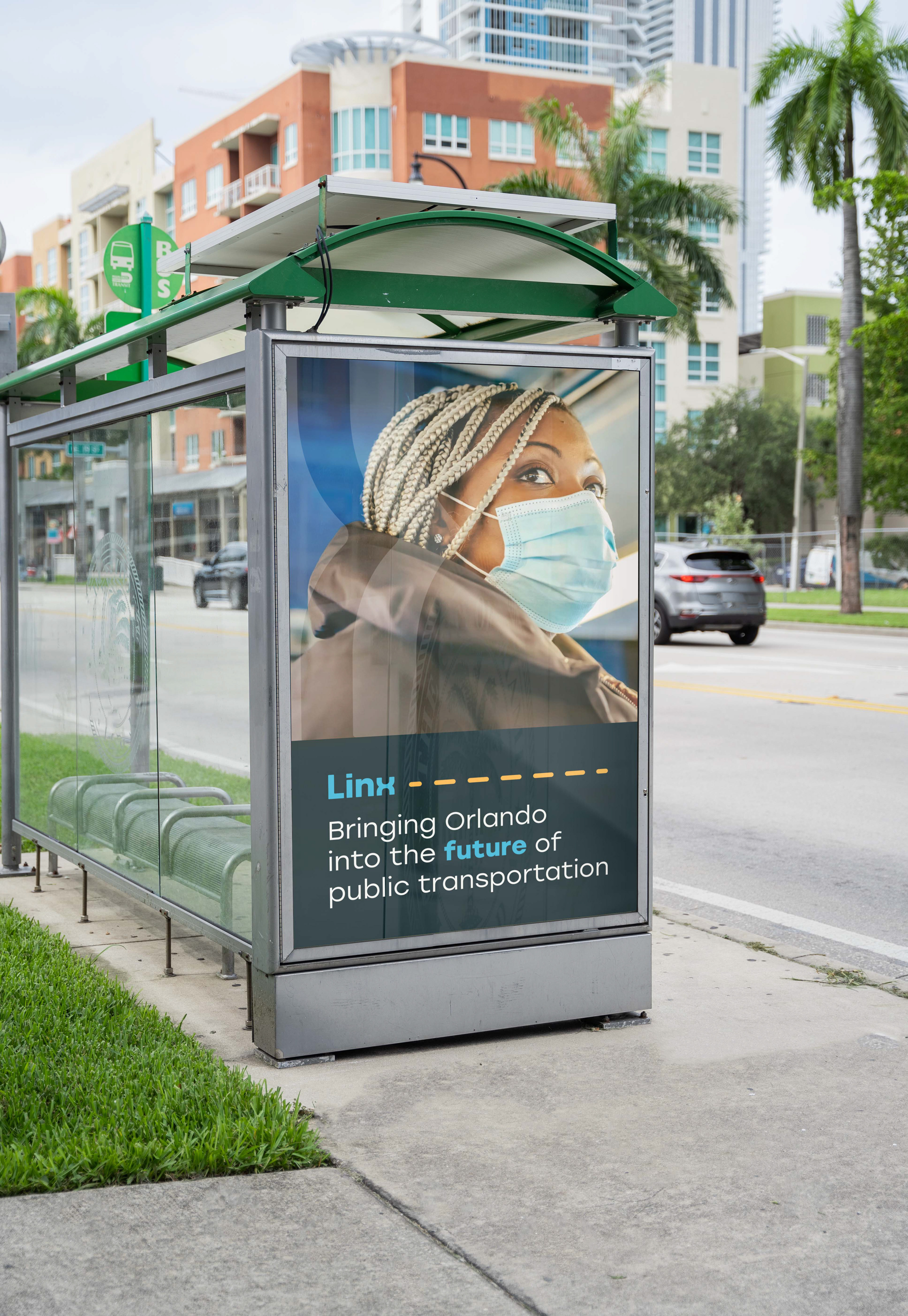
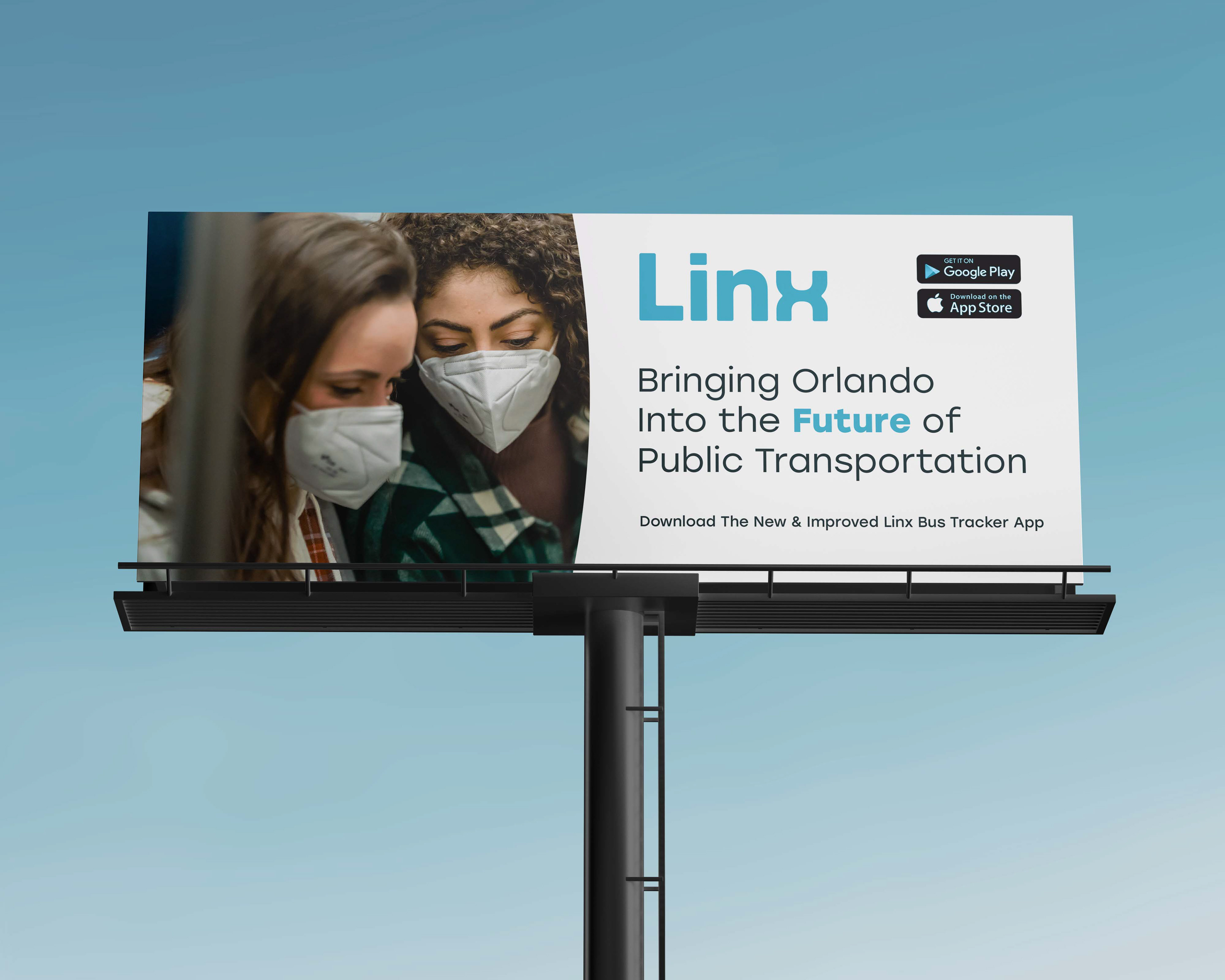
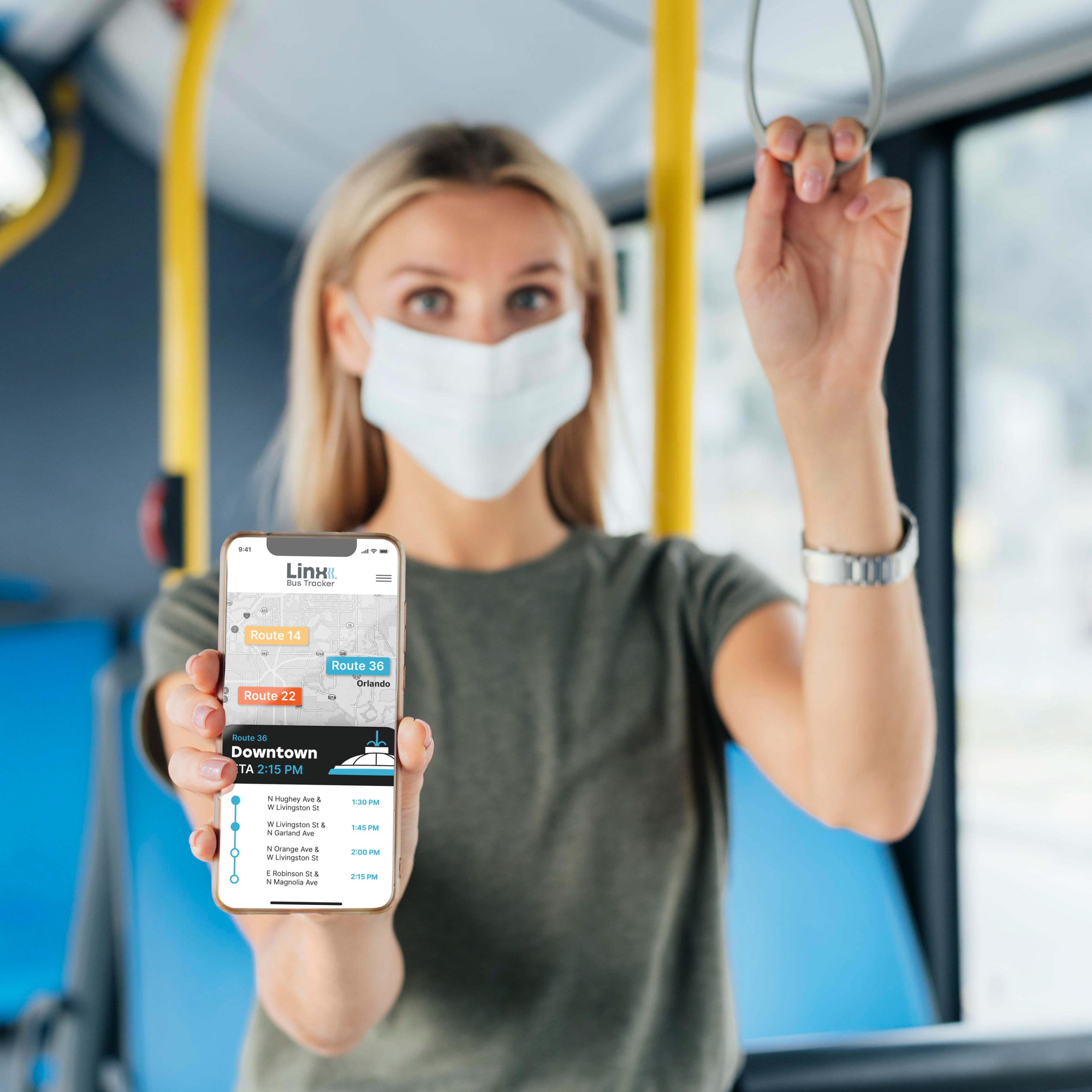
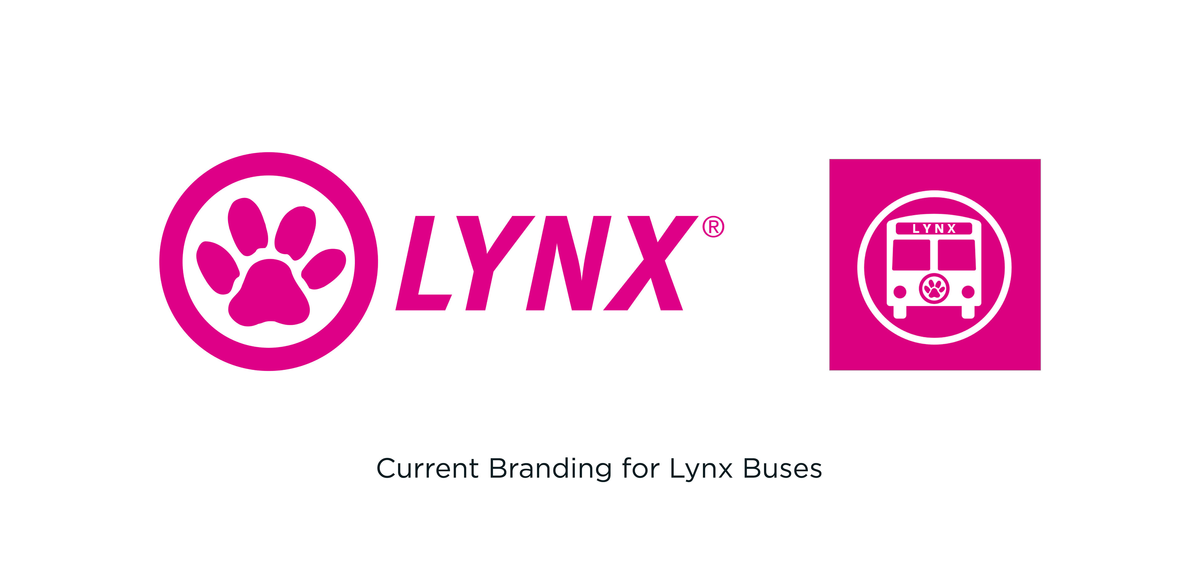
For something that so many people utilize, Lynx’s branding is not very user-friendly. Its app that helps people track their buses is also very poorly-rated. This affects mainly marginalized groups of people who rely on Lynx to get to where they need to go. This is why I decided to steer Lynx away from its bright, pink look and usher it into a responsive, friendlier image.
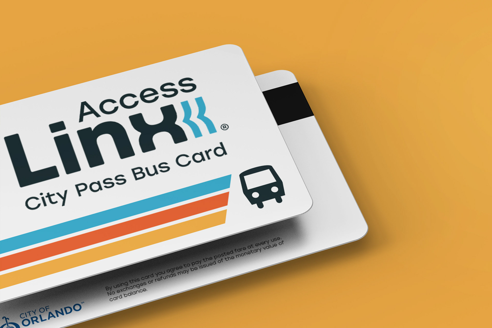
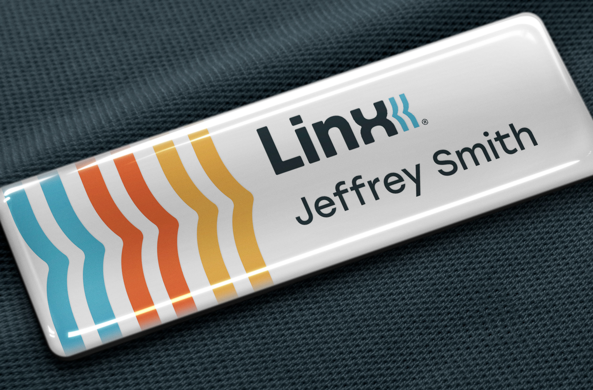
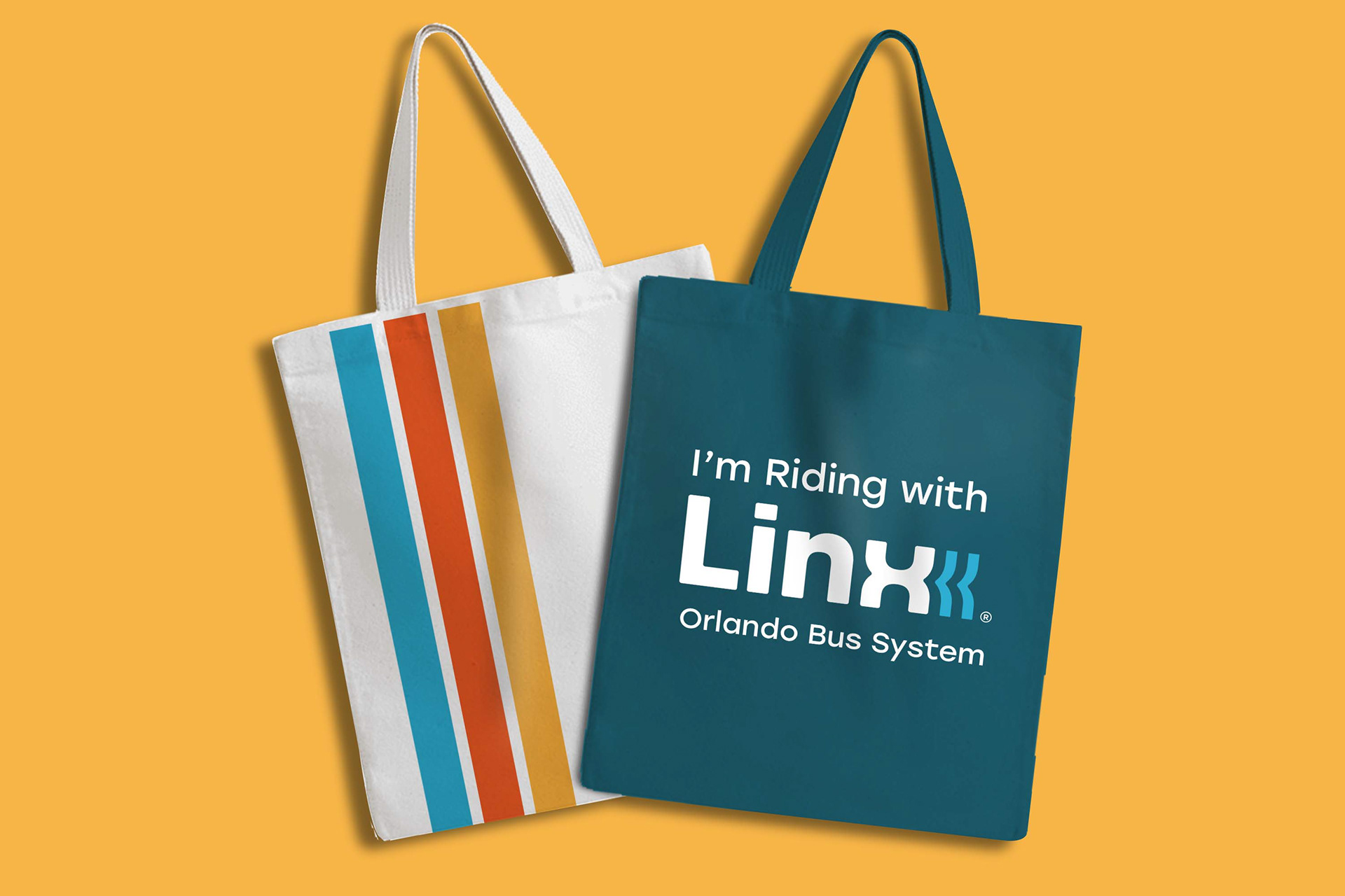
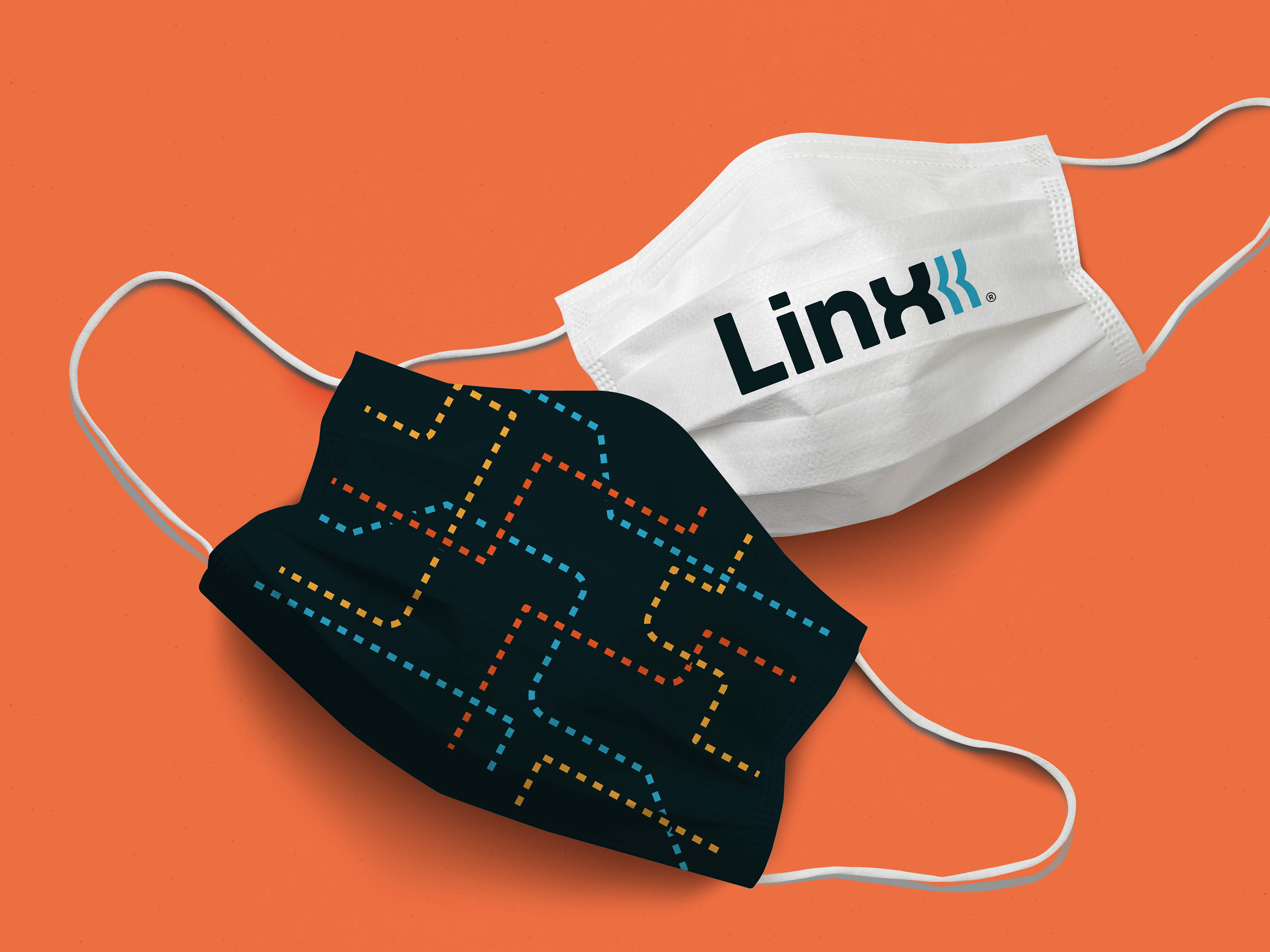
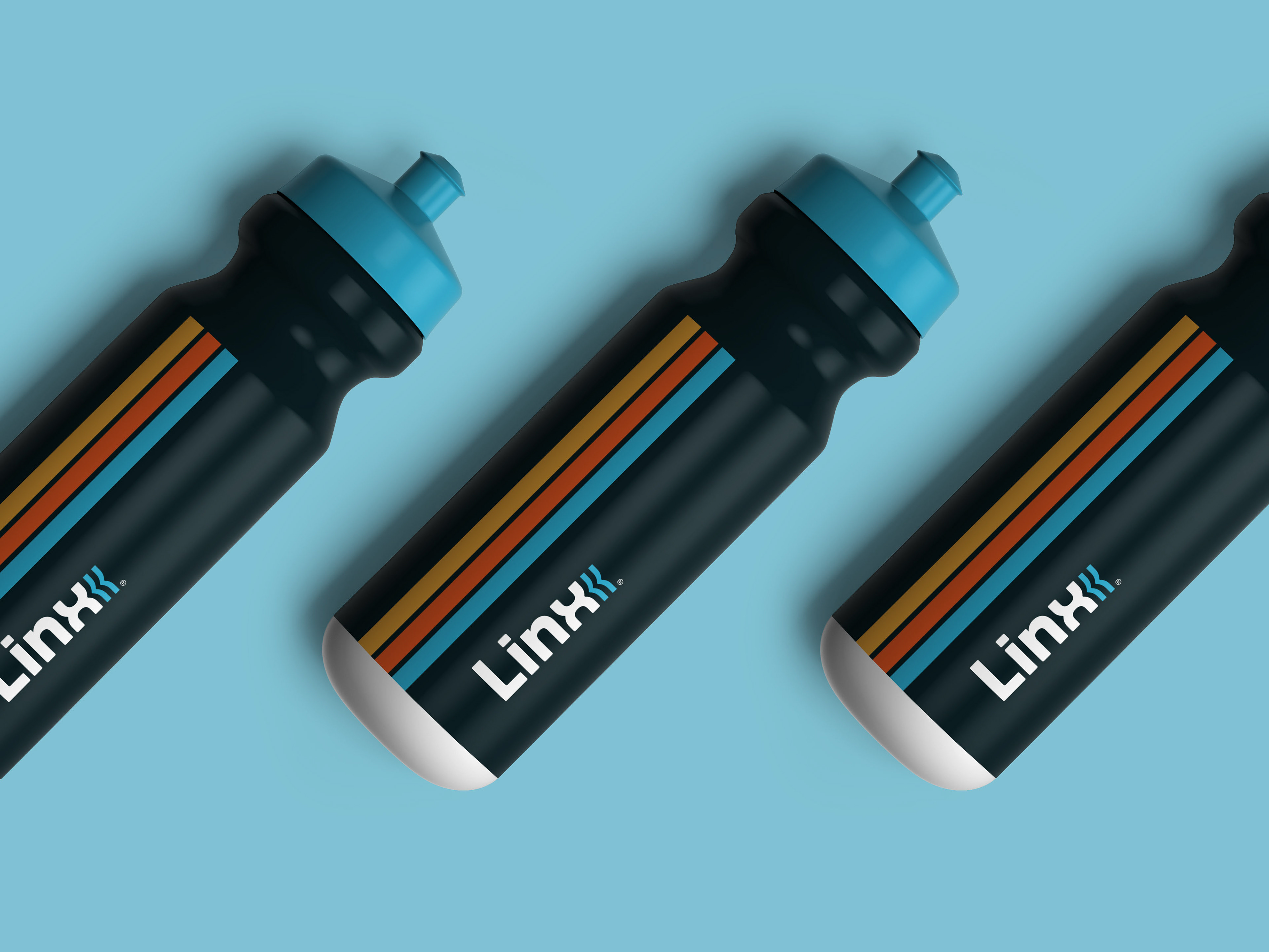
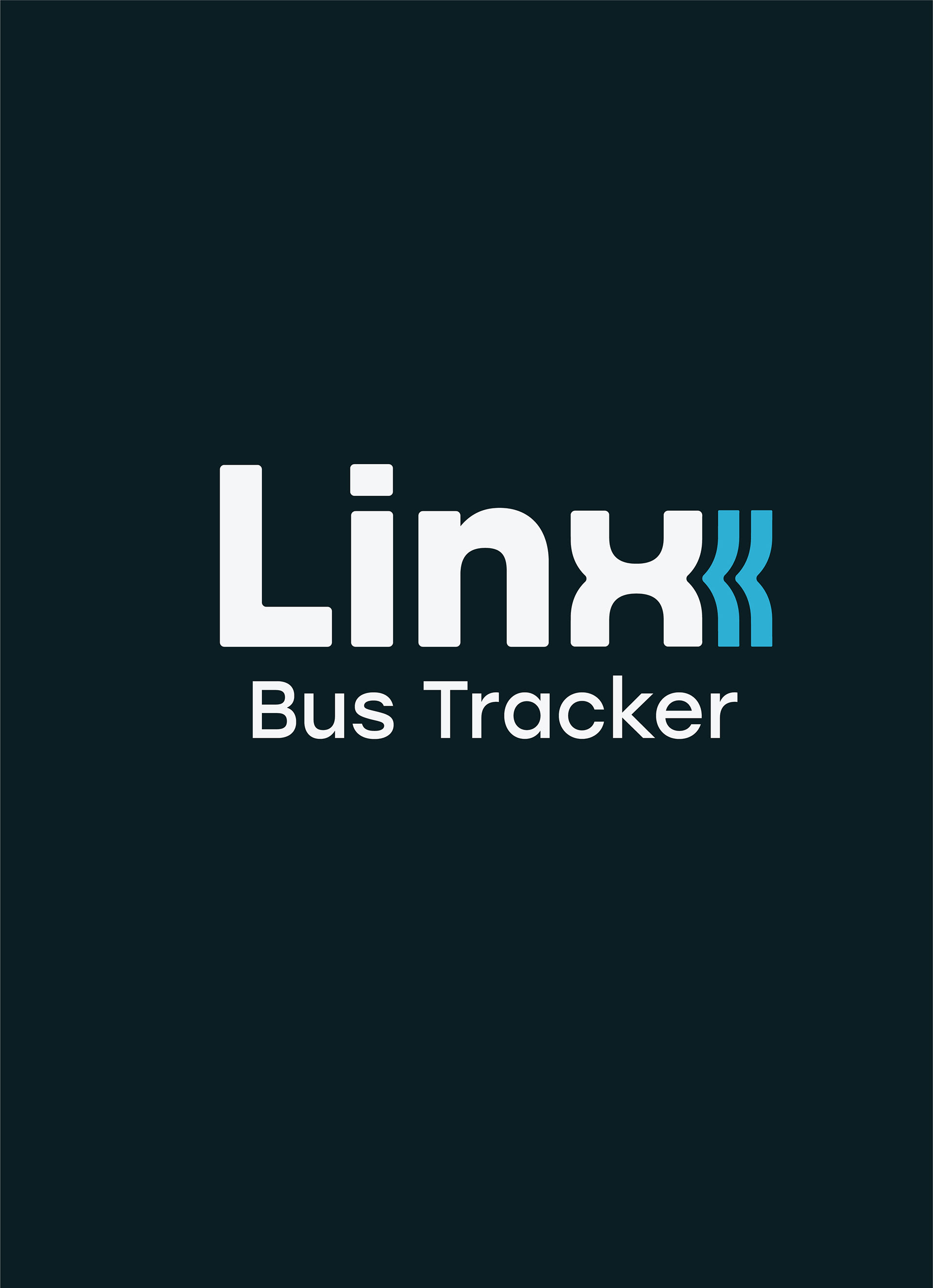
Introducing, Linx. Dropping the “Y”, and separating it from the cat, Linx buses become a refreshed, future-facing system. The type is rounded and readable. The logo is an accent on the wordmark, representing not only movement and forward direction, but also representing water. Water connects not just Central Florida with its many rivers and lakes, but all of Florida. Much like Linx buses’ mission in Orlando: to connect.
THE SOLUTION